This is my second web page that shows a description and pictures of different stages in the progress of a watercolor painting that I am currently working on. The inspiration for this painting is a photograph of a large stalk of Amaryllis flowers that I took at the Arboretum in Washington DC. I visited the Arboretum in August 2006 and took many photographs that may be the source of other paintings I may do someday. For instance, there are some beautiful bonsai trees there that would make some fantastic subjects for future paintings. This painting is done on 28" x 19" on 120 lbs. hot press Bristol board. I've selected the smoother surface of hot-press Bristol board because of the delicate shading that will be required for the leaves and flowers of this painting. Cold-press paper has too much of it's own bumpy texture to allow smooth gradual variegations.
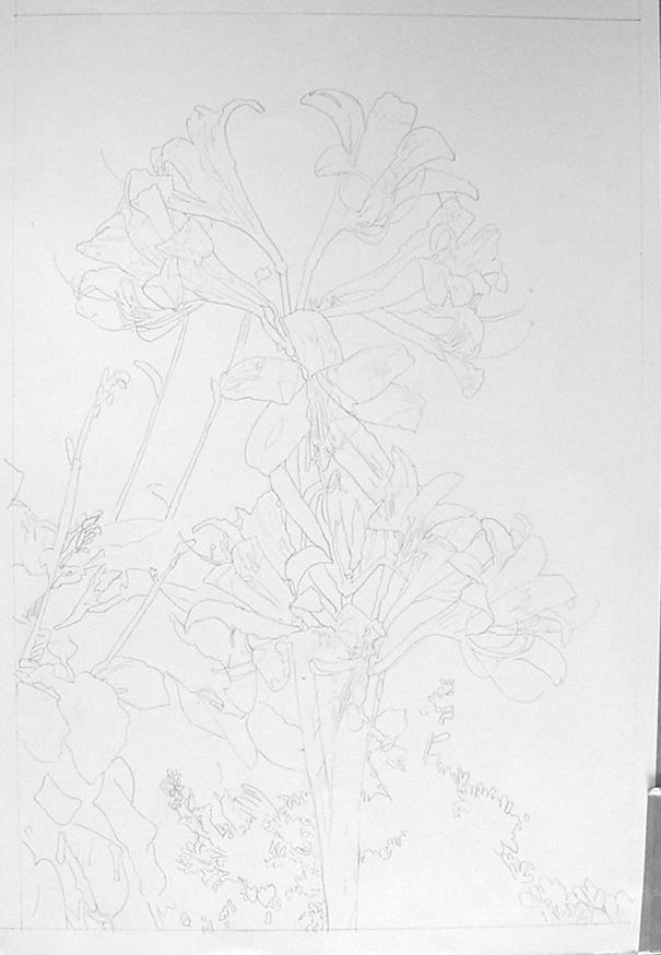
This first picture shows the sketch I did from the photograph. I used a projection method to capture the realistic proportions, shapes, and details of the flower for the sketch. The light flowers will be silhouetted by a very dark shaded background. I used blue painters tape again to hold the picture stationary as I did the drawing. It doesn't tear the paper when removed and can be reused to move or rotate the paper on the table.
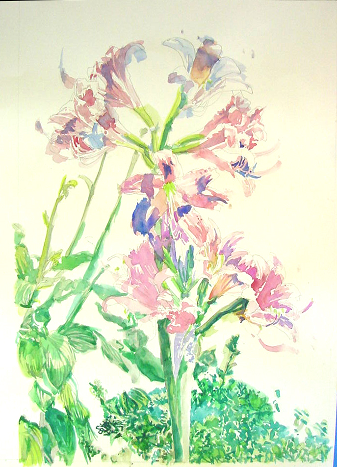
I started painting the variety of yellow-green, green, and blue-green leaves and stems of the flowers. I'm using a mix of Prang Professional Green, Yellow-Green, Blue-Green, and Turquoise-Blue. At this point, I do not need to be careful painting within the sketch pencil lines because the dark blue and black background will cover such mistakes. I also want the greens leaves and stems to be painted loosely with many variegations, so painting them carefully is not necessary. Note that the large area of leaves at the lower right can first be painted all with the lightest green, allowing me to paint the darker greens and negative shapes (holes) and shadows later.
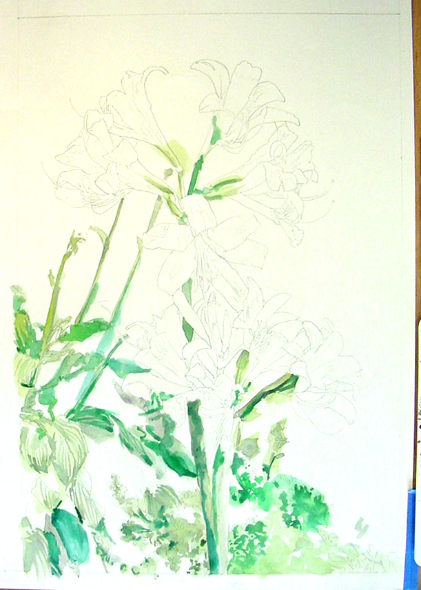
I continue to paint the green stem and leaf areas using darker shades of all the original green colors to paint the negative shapes between the lighter leaves. I continue to work wet-in-wet so that the colors blend and create subtle variegations for texture. There may be more work on the green details that I need to do later, but at this point, I've defined the stems and leaves sufficiently to move and paint the flowers.
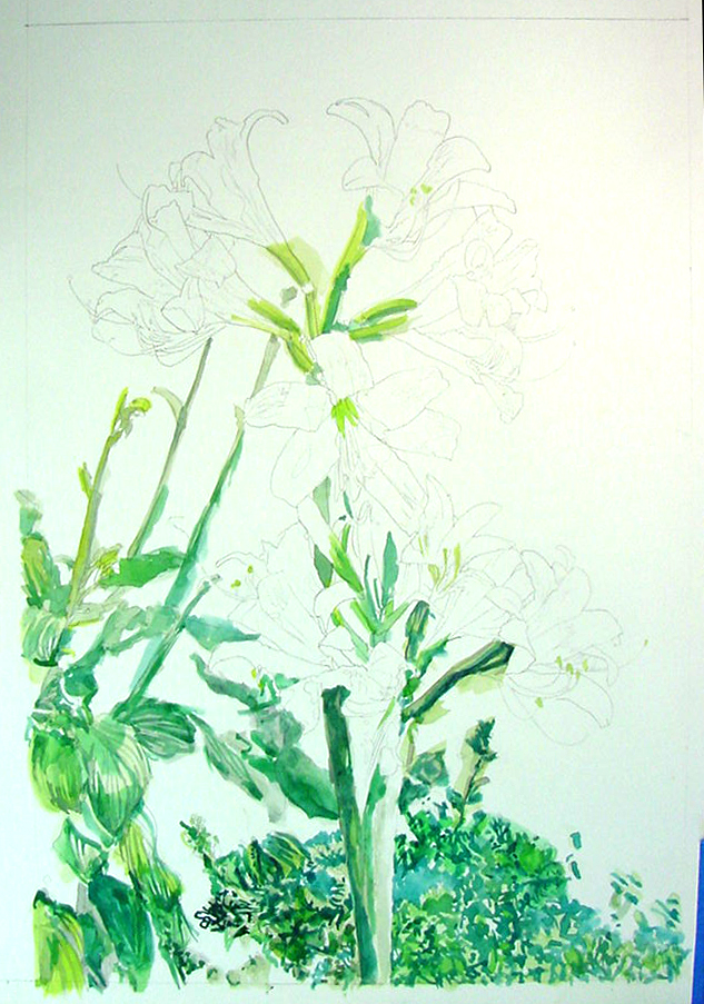
At this stage of the painting, I prepared a large quantity of the pink, red-purple, orange, and blue colors on my palette tray. This is because I want to have enough of the same colors pre-mixed for all of the different flowers. I used variations of pink and orange-pink colors for the parts of the flowers that are highlighted. I used the blue for white parts of the flowers when they are in shadow. And I used the variations of red and purple in areas of the flowers that were both red and in shadow. I continue to use Prang Professional paint for the Red, Orange, Red-Orange, and Yellow areas. Again, I was not concerned about painting over edges of the flowers because these edges will be defined later when I paint the darker background. However, there are white and lighter areas of the flowers that required careful painting of edges... such as the thin stamens coming out of the center of a few of the flowers.
Here I've started to paint in the dark background that silhouette the flowers and leaves. I've outlined the entire group of flowers with a black felt-tip to protect the edges from mistakes when painting the dark background. And then I started a variegated wash of Prang Black that suggest dark leaves in the shadowed background. At this point, I figured that I needed to see the flowers separated by the dark so that I could better see the individual petals of the flowers. You'll note that seeing the dark negative space holes through the flower petals makes the flowers look more three dimensional.
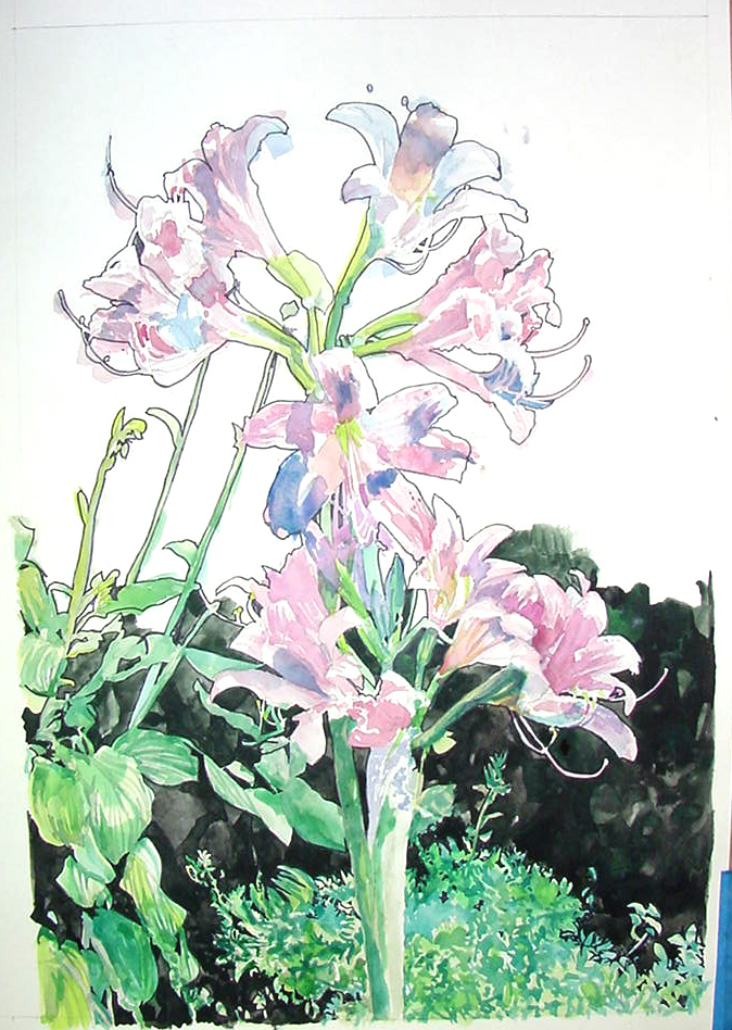
The background in the actual photograph of this flower is completely black, showing no foliage at all behind the flower. But, as I was painting it, I discovered that the large 1" wide paint brush that I was using created an interesting pattern of secondary shadowed leaves and flower stems that I decided to use to add interest to the picture.
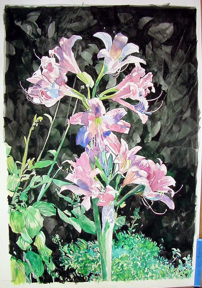
The painting was going well here, but the large blob of green leaves at the bottom required some work. I realized that it required a lot more black negative space (holes) defined. This required a large number of black diamond and triangle-shapes appropriately spaced so that it left small green leaf shapes. I also needed to add some holes in the center between the flowers. To give the background leaves some dimension, I painted a glaze of green to make some of the larger leaves appear closer.
At this stage I need to better define the petals of the flowers. To do this I have painted the edges more carefully and added darker red and blue and purple shading and shadows. I've also done more careful definition of the stamens, painting them pink, orange, and yellow, and painted negative spaces between them to make them stand-out better. I've also painted more green on the closer background leaves. In the center, I've also defined more dark negative spaces (holes) between the flower petals and stamens and the background.
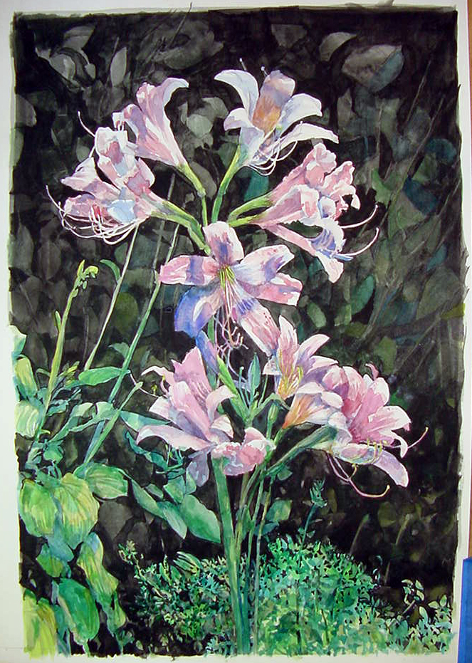
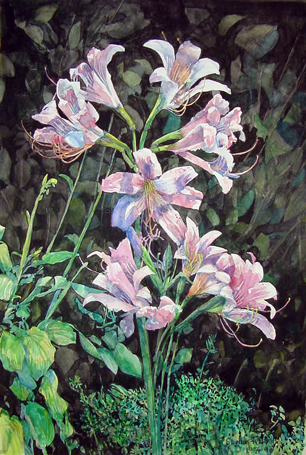
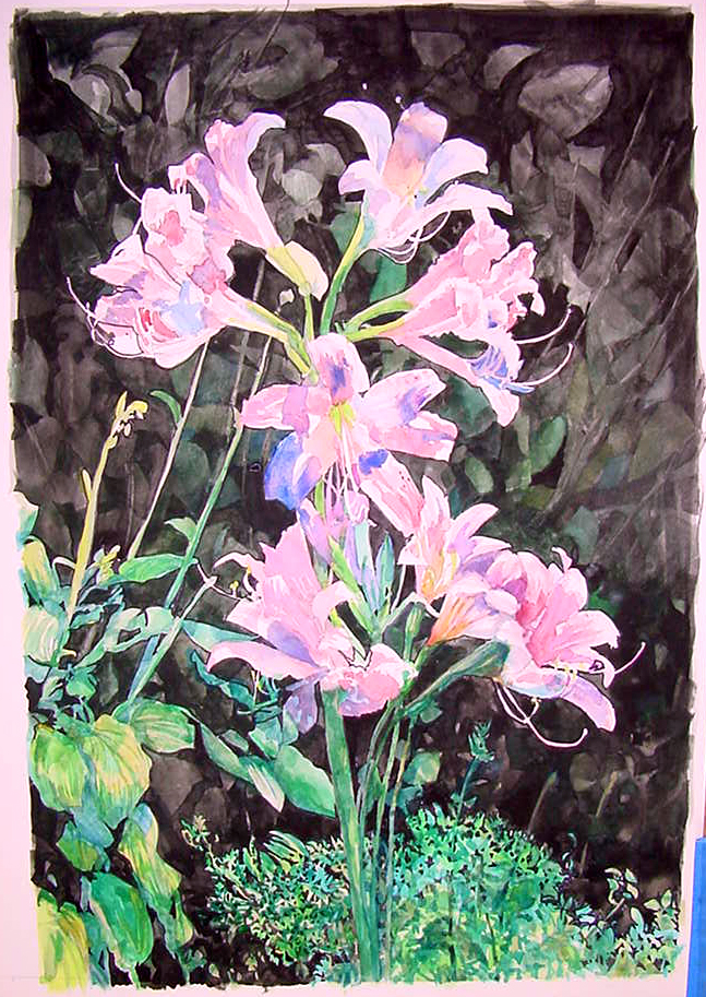
This is the finished painting. It has a number of small additions or changes from the prior stage. I've painted a few more background leaves green, done more definition of white stamens ("lifting" the thin lines in the interiors of each flower) coloring them orange, yellow, and pink, and added more dark holes in the group of small leaves at the bottom. I've added deeper and darker glazes of the red, blue, and purple colors in the flowers and blue and darker green glazes on the leaves on the left. I've also added texture details and defined the rounded flower stems better using blue and blue-green on the darker side of each stem. I signed it in the lower right.